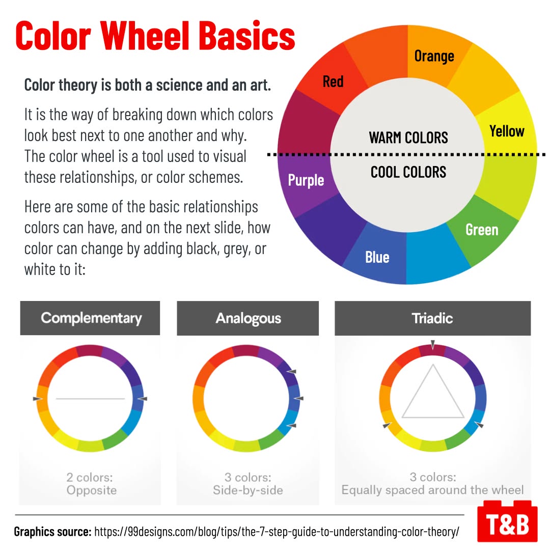
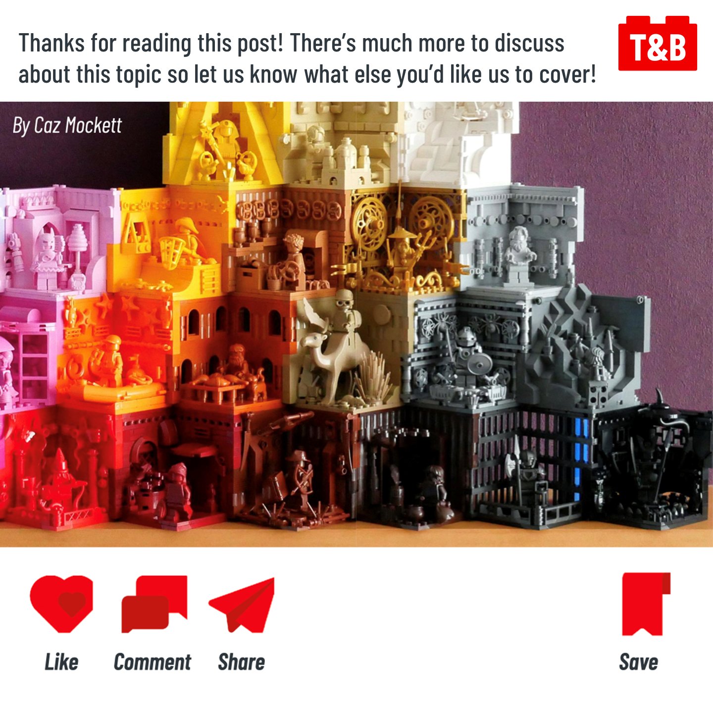
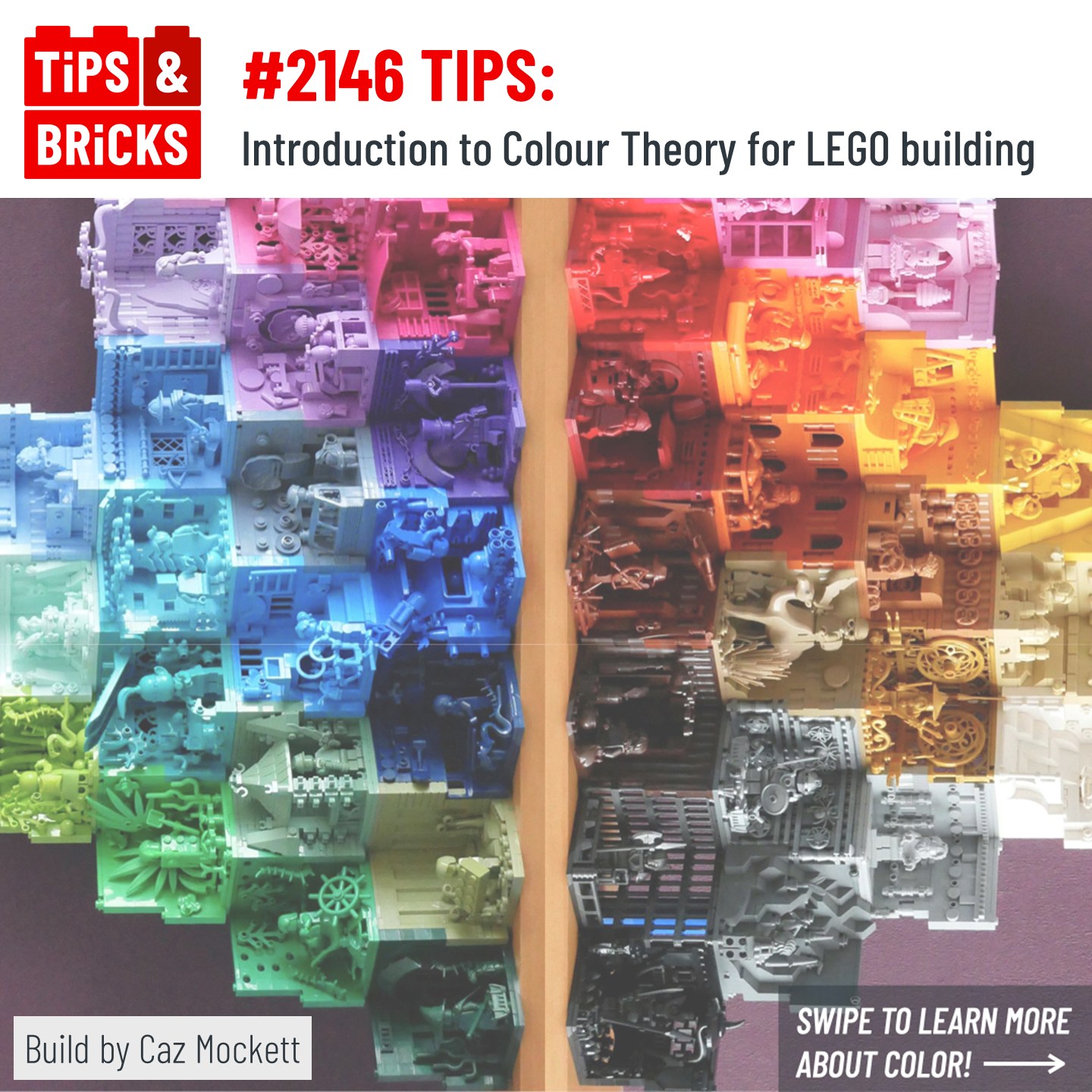
Today we’re taking a look at how to create color schemes for your MOCs! Using examples pulled from some of our favorite builders and MOCs, we wanted to break down the science of what makes certain colors look great next to each other. There is of course an art to color schemes as well and with a nice blend of basic understanding and creativity, you can seriously upgrade your MOC making ability!
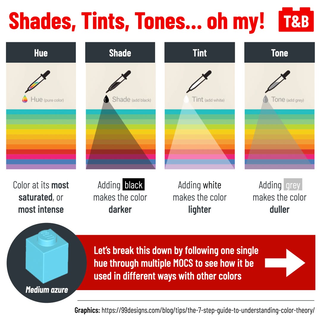
Additional takeaways from this post that are subtly hinted throughout the post, such as mixing complementary colors to make brown, but we also highlight something important to consider outside of your builds: their background. How can the background do more for you than just a blank surface? Can you actually use it to enhance the colors or the texture of your builds? This can help your builds look great and stand out in competitions, on photos feeds, or in your portfolio!
Work featured:
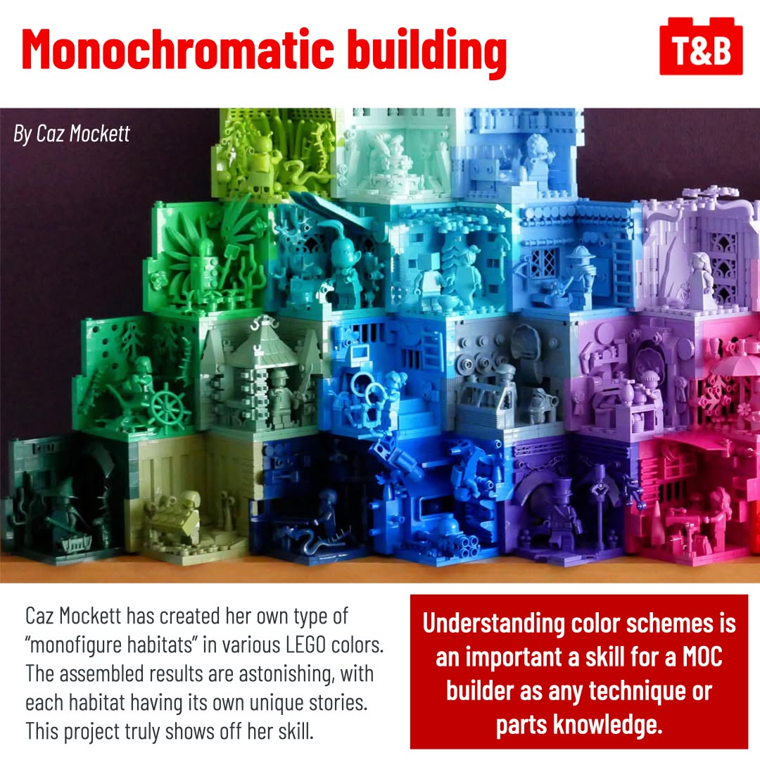
Caz Mockett @cazmockett on Instagram
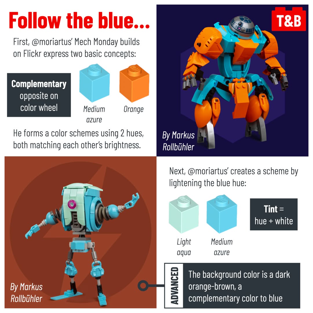
Markus Rollbühler @moriartus (https://www.flickr.com/photos/moriartus)
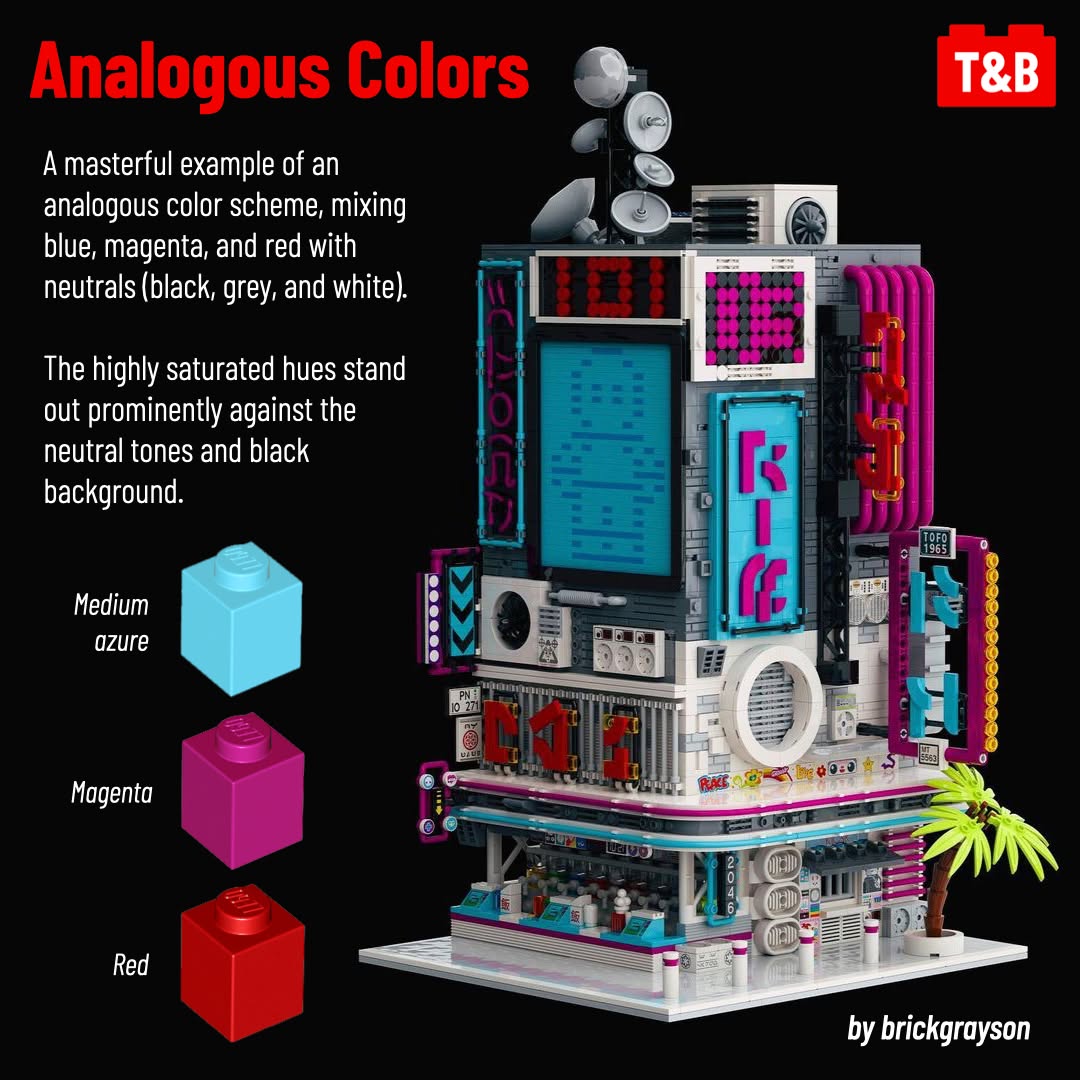
Brick Grayson @brickgrayson on Instagram
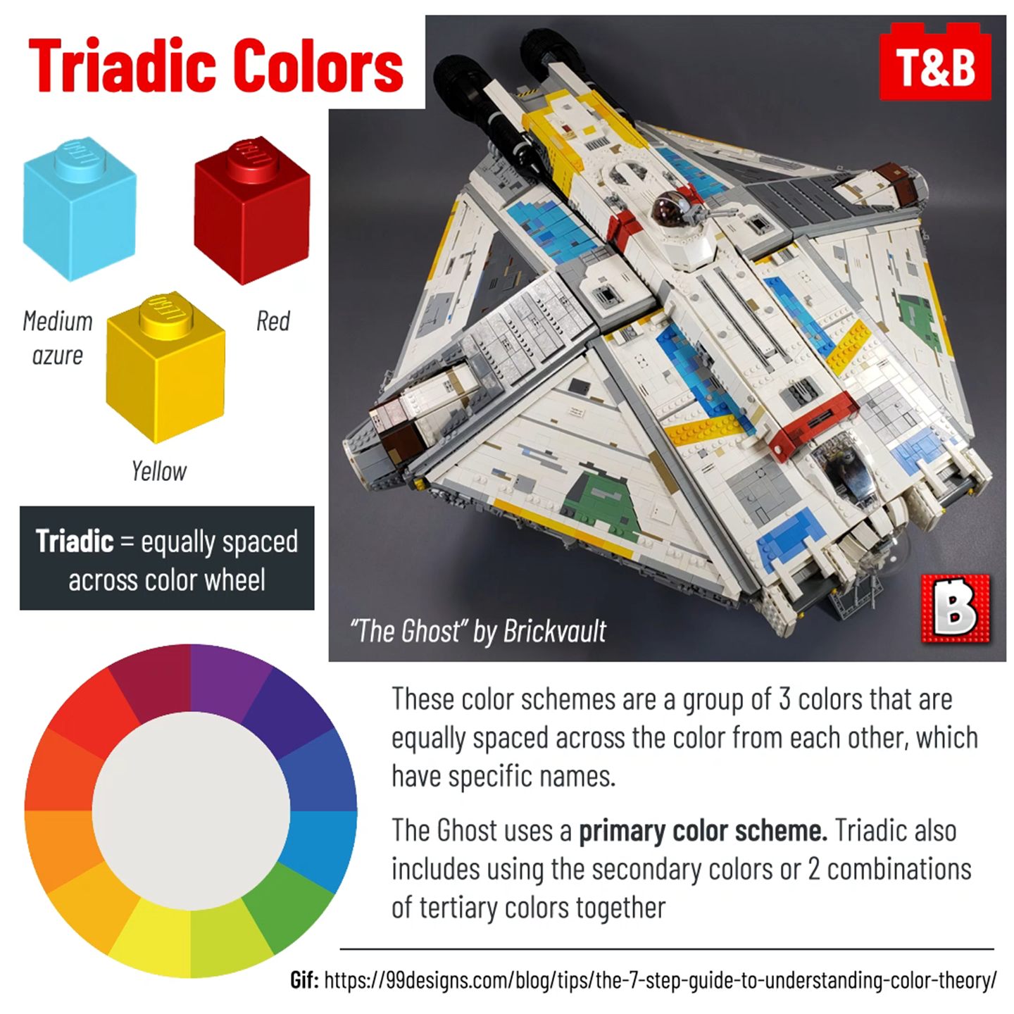
Brickvault @brickvault on Instagram
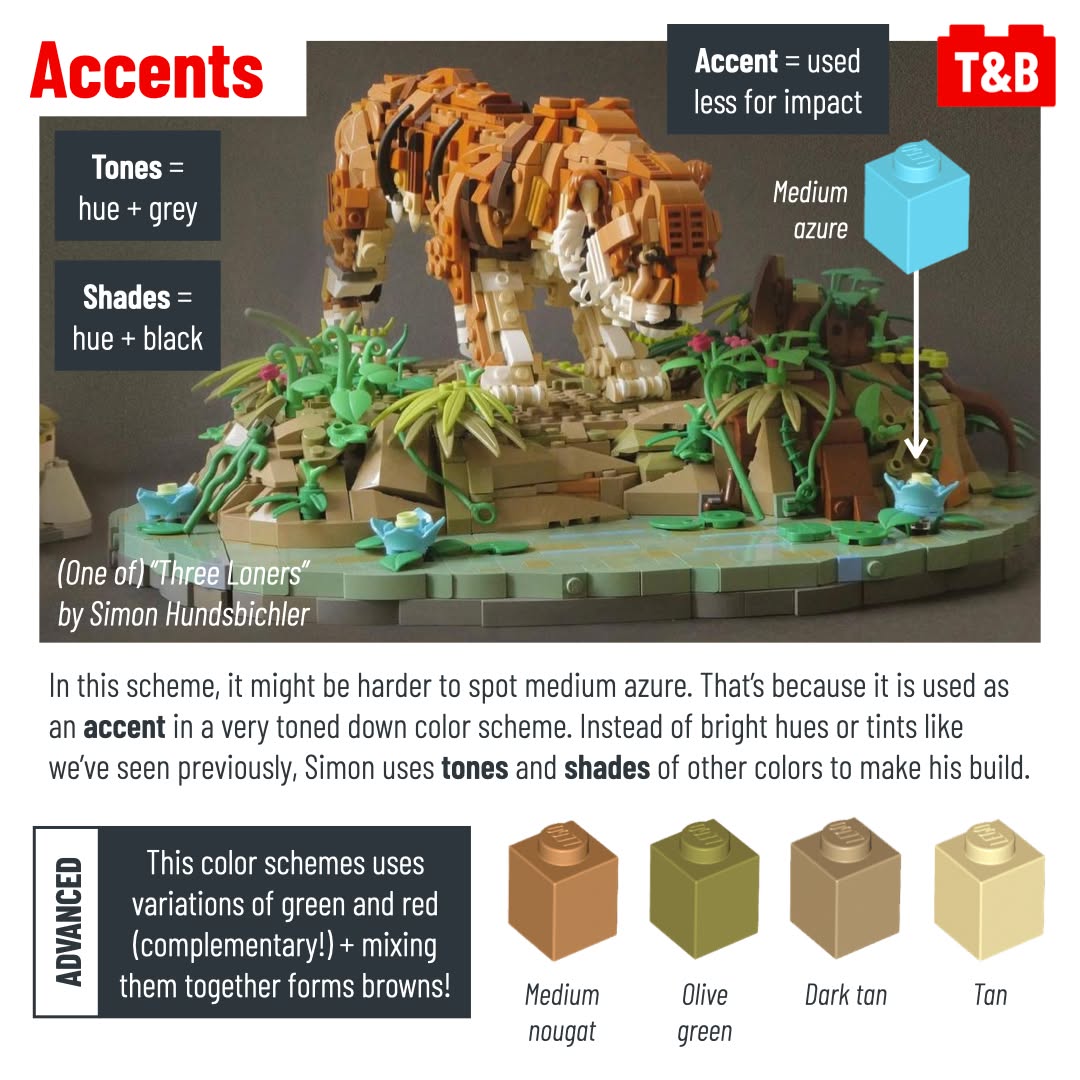
Simon Hundsbichler on Flickr (https://www.flickr.com/photos/138986803@N03/)
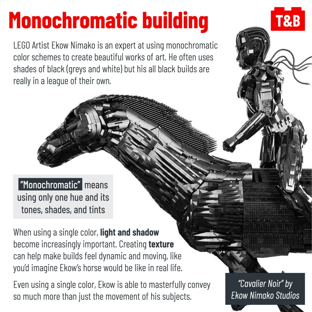
Ekow Nimako Studios @ekownimako on Instagram